When you first look at a trading chart, it can feel like trying to decipher a foreign language. The lines, patterns, and indicators might seem overwhelming, but understanding these visual tools is essential for making informed trading decisions. Trading charts are the roadmaps of the financial markets, illustrating past price movements and offering insights into potential future trends.
Types of Trading Charts You’ll Encounter
Before diving into specific patterns, let’s explore the common types of charts you’ll use on your trading journey.
The Universal Candlestick Chart
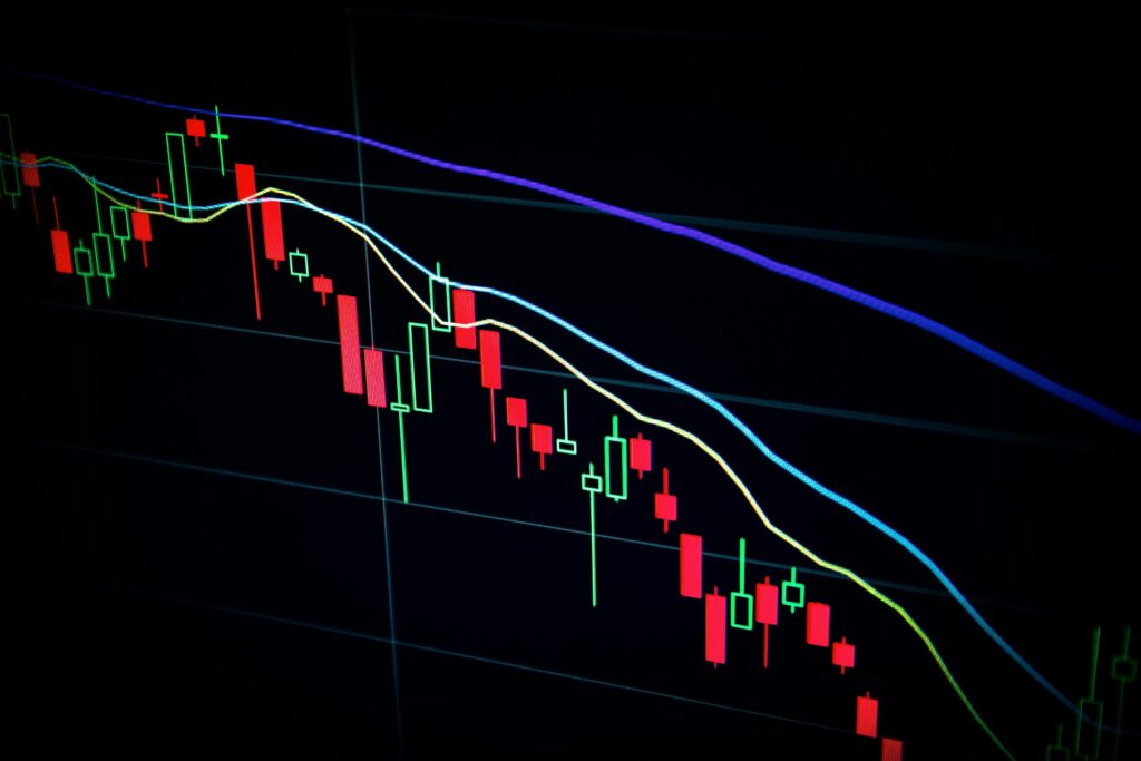
Candlestick charts originated in Japan centuries ago and remain the most popular choice for traders today. Each “candle” represents a specific time period (minutes, hours, days) and shows four key price points: open, close, high, and low.
The rectangular part of the candle (called the “body”) shows the opening and closing prices. If the closing price is higher than the opening price, the body is typically green or white. If the close is lower than the open, the body is red or black. The thin lines extending from the body (called “wicks” or “shadows”) show the highest and lowest prices reached during that period.
Modern trading platforms display these charts clearly, with customisable timeframes (5m, 30m, 1h, 4h, D, W, M, etc.) that allow you to zoom in or out of market activity based on your trading style.
When to Use Line vs Candlestick Charts
Line charts connect closing prices with a simple line, showing price movement trends without the additional data points of candlesticks. This simplicity makes them useful in specific situations:
You can use line charts when:
- You want to focus solely on the overall trend without being distracted by price volatility
- You’re analysing long-term historical movements where minute details are less important
- You’re a beginner, still getting comfortable with chart-reading basics
- You want to identify support and resistance levels more clearly
You can use candlestick charts when:
- You need to analyse market sentiment through open, high, low, and close relationships
- You’re looking for specific reversal or continuation patterns
- You’re day trading or swing trading, where price action details matter significantly
- You want to gauge market volatility by examining the length of wicks
- You’re making decisions based on candlestick patterns like dojis, hammers, or engulfing patterns
Trading interfaces typically allow you to toggle between these chart types with a single click, so you can choose the visualisation that works best for your analysis.
Reading a Candlestick Chart with Clarity
Understanding how to read candlestick formations is your first step toward recognising potential market opportunities.
Basic Candlestick Patterns to Know
Single candlestick patterns like the doji (tiny body with long wicks) can suggest indecision in the market. Hammers and shooting stars (small bodies with one long wick) can indicate potential reversals.
Multiple candle patterns tell more complex stories. For example, the engulfing pattern may occur when a larger candle completely “engulfs” the previous smaller candle, potentially signalling a change in direction.
Think of these patterns as text messages from the market. A doji is like receiving a “maybe” when you ask someone if they want to go out.
Main Trading Chart Indicators for Traders
Modern trading platforms typically offer several essential indicators that can enhance your chart-reading abilities. These tools help identify trends, momentum, and potential reversal points.
MA — Moving Average
The Moving Average (MA) calculates the average price over a specific period, creating a smooth line that helps identify the overall trend direction while filtering out market noise. For example, a 20-day MA adds up the closing prices from the past 20 days and divides by 20.
When the price is above the MA, it can signal an uptrend. When below, it can suggest a downtrend. Crossovers (when price moves from one side of the MA to the other) can signal potential trend changes.
In practice, a trader might use the 200-day MA to identify the long-term trend and the 50-day MA for medium-term direction. If both are rising and the price is above both lines, this could be an indication of an uptrend.
EMA — Exponential Moving Average
The Exponential Moving Average (EMA) works similarly to the standard MA but gives more weight to recent prices, making it more responsive to new information. Their responsiveness to market changes can make EMAs useful in short-term market assessments.
When using both MA and EMA together, traders often watch for the faster EMA to cross above the slower MA as a potential bullish signal, or below as a potential bearish signal. For example, if a 20-day EMA crosses above a 50-day MA, it might indicate strengthening bullish momentum.
Consider how you’d judge your recent spending habits. You might focus more on what you spent last week (like an EMA) rather than averaging your spending equally over the past three months (like a standard MA).
BOLL — Bollinger Bands
Bollinger Bands consist of three lines: a middle band (typically a 20-period moving average) and upper and lower bands set at standard deviations from that average. These bands expand and contract based on market volatility.
When the bands narrow, it may indicate low volatility and potentially signal an upcoming significant price movement. When they widen, volatility is high. Prices tend to bounce between the upper and lower bands, making them useful for identifying potential reversal points.
Think of Bollinger Bands like the boundaries of a river. During dry seasons, the riverbanks narrow. During flood season, they expand. Trading in narrow bands is like canoeing in a calm, predictable river. When the bands widen, you’re heading into rapids — higher risk, but also the potential for greater price movement
Putting It All Together: A Practical Trading Chart Scenario
Let’s apply what we’ve learned to a common scenario: a trader monitoring CFD on EUR/USD on a daily candlestick chart.
The trader notices prices have been trending upward with a series of higher highs and higher lows. Activating the MA indicator shows the price sitting comfortably above the 50-day moving average, confirming the uptrend.
The trader then adds the Bollinger Bands indicator and notices the price is approaching the upper band while the bands themselves are widening, suggesting increasing volatility. Based on these signals, they might decide to watch closely for signs of a potential pullback, especially if a bearish candlestick pattern forms near the upper band.
Meanwhile, the EMA indicator shows the 20-day EMA has crossed above the 50-day MA, providing additional confirmation of bullish momentum. This combination of indicators and candlestick patterns gives the trader a more comprehensive picture than any single factor alone.
Next Steps in Your Chart Pattern Recognition Journey
Understanding trading chart patterns is not about memorising shapes but developing an intuition for market psychology. Start by focusing on a few basic patterns and indicators rather than trying to master everything at once.
Practice identifying patterns on historical charts, then track how the market responded. Many platforms like Mitrade offer demo accounts where you can test your chart-reading skills without risking real money.
Remember that how to read trading charts is just one piece of your trading education. Combine chart analysis with understanding market fundamentals and developing a solid risk management strategy for a more complete approach.
Ready to put your chart reading skills into practice? Register an account to access comprehensive charting tools with customisable indicators designed for traders at every level.